Posted inUK University Interview Questions University of Aberdeen Medicine Interview Questions Below are sample questions commonly asked during university admission interviews, especially for students applying to the University of… Posted by
Posted inUK University Interview Questions University of East London Interview Questions Below are sample questions commonly asked during university admission interviews, especially for students applying to the University of… Posted by
Posted inMaps IELTS Writing Task 1 The map below is of the town of Garlsdon. A new supermarket (S) is planned for the town. The map shows two possible sites for the supermarket. The map shows two potential locations (S1 and S2) for a new supermarket in a town calledGarlsdon.The main… Posted by
Posted inProcess Diagram The diagrams below show some principles of house design for cool and for warm climates The diagrams show how house designs differ according to climate.The most noticeable difference between houses designed for cool… Posted by
Posted inProcess Diagram IELTS Writing Task 1 The diagram below shows the process by which bricks are manufactured for the building industry. The diagram illustrates different stages in the process of manufacturing bricks from thedigging step to delivery.At the beginning… Posted by
Posted inComparative Graph IELTS Writing Task 1 The bar chart shows the monthly spending in dollars of a family in the USA on three temsin 2010. The bar chart depicts the monthly expenditure on food, gas and clothing of affirmably living in the USA… Posted by
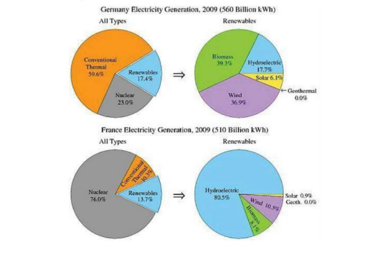
Posted inComparative Graph IELTS Writing Task 1 IELTS Writing Task 1 : The pie charts show the electricity generated in Germany and France from all sources and renewables in the year 2009 The four pie charts compare the electricity generated between Germany and France during2009, and it is measured in… Posted by
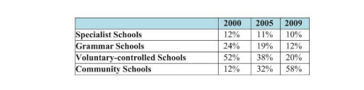
Posted inComparative Graph IELTS Writing Task 1 IELTS Writing Task 1:The table shows the Proportions of Pupils Attending Four Secondary School Types Between 2000 and 2009 The table illustrates the percentage of school children attending four different types ofsecondary school from 2000 to 2009.… Posted by
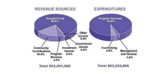
Posted inComparative Graph IELTS Writing Task 1 IELTS Writing Task 1:The pie chart shows the amount of money that a children’s charity located in the USA spent and received in one year. The pie charts show the amount of revenue and expenditures over a year of a children'scharity in the… Posted by
Posted inComparative Graph IELTS Writing Task 1 IELTS Writing Task 1: The table below shows changes in the numbers of residents cycling to work in different areas of the UK between 2001 and 2011 The table compares the numbers of people who cycled to work in twelve areas of the UK inthe… Posted by