Skip to content
listeningwritingmodule.com
  • Home
  • About Us
  • IELTS
  • PTE
  • TOEFL
  • Contact
  • Facebook
  • Instagram
  • Youtube
Subscribe

Comparative Graph

The bar chart shows the monthly spending in dollars of a family in the USA on three temsin 2010
Posted inComparative Graph IELTS Writing Task 1

The bar chart shows the monthly spending in dollars of a family in the USA on three temsin 2010.

The bar chart depicts the monthly expenditure on food, gas and clothing of affirmably living in the USA…
Posted by
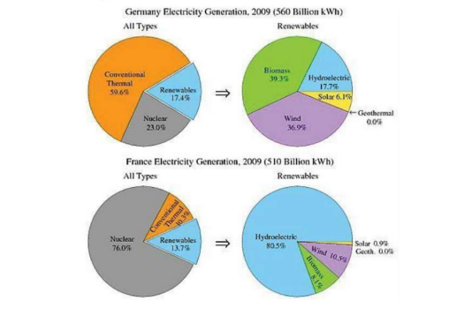
The pie charts show the electricity generated in Germany and France from all sources and renewables in theyear 2009
Posted inComparative Graph IELTS Writing Task 1

IELTS Writing Task 1 : The pie charts show the electricity generated in Germany and France from all sources and renewables in the year 2009

The four pie charts compare the electricity generated between Germany and France during2009, and it is measured in…
Posted by
Secondary School Attendance
Posted inComparative Graph IELTS Writing Task 1

IELTS Writing Task 1:The table shows the Proportions of Pupils Attending Four Secondary School Types Between 2000 and 2009

The table illustrates the percentage of school children attending four different types ofsecondary school from 2000 to 2009.…
Posted by
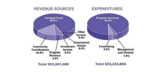
The pie chart shows the amount of money that a children'scharity located in the USA spent and received in one year
Posted inComparative Graph IELTS Writing Task 1

IELTS Writing Task 1:The pie chart shows the amount of money that a children’s charity located in the USA spent and received in one year.

The pie charts show the amount of revenue and expenditures over a year of a children'scharity in the…
Posted by
f residents cycling towork in different areas of the UK between 2001 and 2011
Posted inComparative Graph IELTS Writing Task 1

IELTS Writing Task 1: The table below shows changes in the numbers of residents cycling to work in different areas of the UK between 2001 and 2011

The table compares the numbers of people who cycled to work in twelve areas of the UK inthe…
Posted by
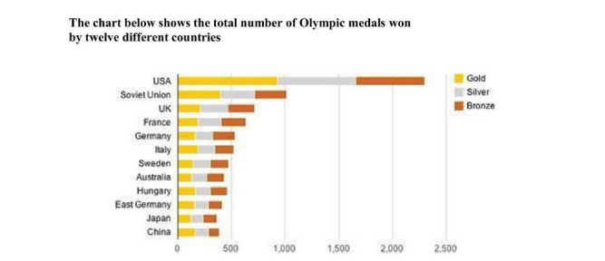
The chart below shows the total number of Olympic medals won by twelve different countries
Posted inComparative Graph IELTS Writing Task 1

IELTS Writing Task 1:The chart below shows the total number of Olympic medals won by twelve different countries

The bar chart compares twelve countries in terms of the overall number of medals that theyhave won at…
Posted by
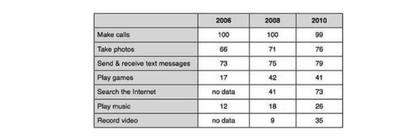
IELTS Writing Task 1:The percentage of people using various mobile phone features
Posted inComparative Graph IELTS Writing Task 1

IELTS Writing Task 1:The percentage of people using various mobile phone features

The table compares the percentages of people using different functions of their mobilephones between 2006 and 2010.Throughout the…
Posted by
The table gives information about poverty rates among six types of household in Australia in the year 1999.
Posted inComparative Graph IELTS Writing Task 1

IELTS Writing Task 1:The table below shows the proportion of different categories of families living in poverty in Australia in 1999.Write a report for a university lecturer describing the information shown below. Make comparisons where relevant.

It is noticeable that levels of poverty were higher for single people than for couples,and people with children…
Posted by
The table shows data about the underground rail networks in six major cities.
Posted inIELTS Writing Task 1 Comparative Graph

IELTS Writing Task 1:The table below gives information about the underground railway systems in six cities. Write a report for a university lecturer describing the information shown below. Make comparisons where relevant.

The table compares the six networks in terms of their age, size and the number ofpeople who use…
Posted by
The proportion of carbohydrates, protein and fat in three different diets
Posted inIELTS Writing Task 1 Comparative Graph

IELTS Writing Task 1:The table below gives information on the proportion of carbohydrates, protein and fat In Focus three different diets. Write a report for a university lecturer describing the information shown below. Make comparisons where relevant.

The pie charts compare the proportion of carbohydrates, protein and fat in threedifferent diets, namely an average diet,…
Posted by

Posts pagination

1 2 Next page

Recent Posts

  • University of Aberdeen Medicine Interview Questions
  • University of East London Interview Questions
  • The map below is of the town of Garlsdon. A new supermarket (S) is planned for the town. The map shows two possible sites for the supermarket.
  • The diagrams below show some principles of house design for cool and for warm climates
  • The diagram below shows the process by which bricks are manufactured for the building industry.

Recent Comments

  1. Wealth Management on The map below is of the town of Garlsdon. A new supermarket (S) is planned for the town. The map shows two possible sites for the supermarket.
  2. Forum on The map below is of the town of Garlsdon. A new supermarket (S) is planned for the town. The map shows two possible sites for the supermarket.
  3. Накрутка пф on The map below is of the town of Garlsdon. A new supermarket (S) is planned for the town. The map shows two possible sites for the supermarket.
  4. Investing on The map below is of the town of Garlsdon. A new supermarket (S) is planned for the town. The map shows two possible sites for the supermarket.
  5. Накрутка пф on The map below is of the town of Garlsdon. A new supermarket (S) is planned for the town. The map shows two possible sites for the supermarket.

Archives

  • April 2025
  • March 2025
  • February 2024

Categories

  • Comparative Graph
  • Graph with Trends
  • IELTS Writing Task 1
  • Maps
  • Process Diagram
  • UK University Interview Questions
  • Uncategorized

John Doe

John Doe is a versatile writer with a passion for storytelling. With a background in literature and a love for exploring diverse themes, his words captivate and resonate with readers across genres.

  • Facebook
  • Twitter
  • Instagram
  • LinkedIn
  • YouTube
  • Pinterest

Recent Posts

  • University of Aberdeen Medicine Interview Questions
  • University of East London Interview Questions
  • The map below is of the town of Garlsdon. A new supermarket (S) is planned for the town. The map shows two possible sites for the supermarket.
    The map below is of the town of Garlsdon. A new supermarket (S) is planned for the town. The map shows two possible sites for the supermarket.
  • The diagrams below show some principles of house design for cool and for warm climates
    The diagrams below show some principles of house design for cool and for warm climates

Categories

  • Comparative Graph
  • Graph with Trends
  • IELTS Writing Task 1
  • Maps
  • Process Diagram
  • UK University Interview Questions
  • Uncategorized
Tags

Academic Writing Tips Comparative Graph IELTS Band 9 Model Answer IELTS Task 1 Graph Analysis IELTS Task 1 Line Graph IELTS Vocabulary IELTS Writing Exercises IELTS Writing Exercises Academic Writing Tips IELTS Writing Task 1 Monthly Temperature and Precipitation Process Diagram

Ads
About Listening Writing Module

When an obscure printer gathered a galley and jumbled it to craft a sample book, it lasted not just five decades but five centuries.

  • Facebook
  • Instagram
  • YouTube
Categories
  • Comparative Graph
  • Graph with Trends
  • IELTS Writing Task 1
  • Maps
  • Process Diagram
  • UK University Interview Questions
  • Uncategorized
  • University of Aberdeen Medicine Interview Questions
  • University of East London Interview Questions
  • The map below is of the town of Garlsdon. A new supermarket (S) is planned for the town. The map shows two possible sites for the supermarket.
    The map below is of the town of Garlsdon. A new supermarket (S) is planned for the town. The map shows two possible sites for the supermarket.
Copyright 2025 — listeningwritingmodule.com. All rights reserved.
Design By HLC Solutions
Scroll to Top