Posted inProcess Diagram The diagrams below show some principles of house design for cool and for warm climates The diagrams show how house designs differ according to climate.The most noticeable difference between houses designed for cool… Posted by
Posted inProcess Diagram IELTS Writing Task 1 The diagram below shows the process by which bricks are manufactured for the building industry. The diagram illustrates different stages in the process of manufacturing bricks from thedigging step to delivery.At the beginning… Posted by
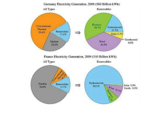
Posted inComparative Graph IELTS Writing Task 1 IELTS Writing Task 1 : The pie charts show the electricity generated in Germany and France from all sources and renewables in the year 2009 The four pie charts compare the electricity generated between Germany and France during2009, and it is measured in… Posted by
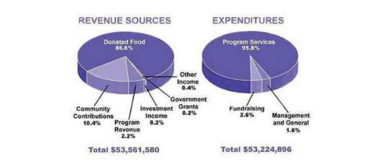
Posted inComparative Graph IELTS Writing Task 1 IELTS Writing Task 1:The pie chart shows the amount of money that a children’s charity located in the USA spent and received in one year. The pie charts show the amount of revenue and expenditures over a year of a children'scharity in the… Posted by
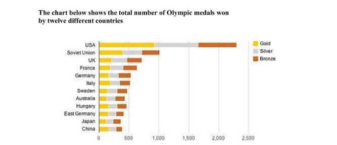
Posted inComparative Graph IELTS Writing Task 1 IELTS Writing Task 1:The chart below shows the total number of Olympic medals won by twelve different countries The bar chart compares twelve countries in terms of the overall number of medals that theyhave won at… Posted by
Posted inComparative Graph IELTS Writing Task 1 IELTS Writing Task 1:The table below shows the proportion of different categories of families living in poverty in Australia in 1999.Write a report for a university lecturer describing the information shown below. Make comparisons where relevant. It is noticeable that levels of poverty were higher for single people than for couples,and people with children… Posted by
Posted inIELTS Writing Task 1 Comparative Graph IELTS Writing Task 1:The table below gives information about the underground railway systems in six cities. Write a report for a university lecturer describing the information shown below. Make comparisons where relevant. The table compares the six networks in terms of their age, size and the number ofpeople who use… Posted by
Posted inIELTS Writing Task 1 Comparative Graph IELTS Writing Task 1:The table below gives information on the proportion of carbohydrates, protein and fat In Focus three different diets. Write a report for a university lecturer describing the information shown below. Make comparisons where relevant. The pie charts compare the proportion of carbohydrates, protein and fat in threedifferent diets, namely an average diet,… Posted by
Posted inIELTS Writing Task 1 Comparative Graph IELTS Writing Task 1:The table below gives information on average hours and minutes spent by UK males and females on different daily activities. The table compares the average amount of time per day that men and women inthe UK spend doing… Posted by
Posted inIELTS Writing Task 1 Graph with Trends IELTS Writing Task 1:The graph shows the hours spent in different study methods during a two year course The graph shows the number of weekly hours spent studying in the library, with atutor or lecturer or… Posted by